A Minute With Jessica
A Few Of My Favorite Websites
Since I feel the need to have my voice heard (it’s been a while), I thought I would share a few of my favorite websites and why.
In my line of work I see a lot of bad websites and experience a great loss of sleep over this on a frequent basis, so if you are one of the offenders, just hire us, or find someone to help you stop hurting the eyeballs of innocent web viewers.
Here are some companies that have sites that I like and my thoughts about why they are easy on my eyes:
1. www.wag.com (You may recall this one from another post)
It helps that they sell pet supplies, which give them a chance to use really cute photos and take a high degree of creative license. However, they go above and beyond when it comes to creating a fun (and super easy to navigate) site.
The company banner recalls a storefront and is unique in having the logo as a cutout. The central placement of the search bar with category search dropdown menu makes searching the site a cinch.

Even when you scroll down the page, the design details continue. For example, the tops of the cute category boxes:

2. www.delusciouscookies.com
LA Dezign designed the Delucious Cookies website, which I must say made me start dreaming of cookies and want to send the gift baskets to everyone I love. One of the things that I like best about the site is that there is a lot of white space and very good photographs, which allow the cookies to essentially sell themselves. For such sites as this that are selling sin or glamour, images and descriptions have to be compelling. For example, you had me at ‘Bailey’s buttercream:”

3. www.marlonbrando.com
Another site that we designed that I love is the site for the Marlon Brando Estate. It was a great privilege for our team to work on designing a site for such an icon. We were able to really take a new approach in terms of creating a “cool” design rather than something intended to sell or communicate a corporate professionalism. We kept it simple, and used some great photographs to fill out the space as you can see from this cutout from the home page of the site:

4. www.godiva.com
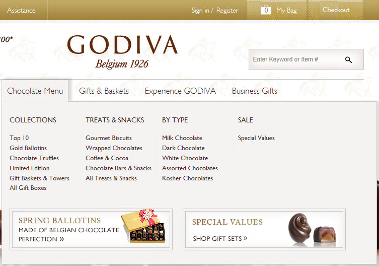
It is easy to sell my chocolate, but Godiva takes this to a whole new level in their gorgeous website design. I like the different navigation menu items, especially the fact that they gear one of them to an upcoming holiday. For example, the first top navigation menu item at present is for Mother’s Day which is soon approaching. Very smart people.
![]()
From there the navigation gets smarter in the dropdown menus and still remains highly visual (again an important element for selling sweets):

While I could keep going with this, it is just a start. Have a look at some of the sites or start taking note of certain sites that you like. How does your website compare? Does it reflect your unique brand and does it excite, entice, or motivate your target audience? If not, maybe it is time to ask for help because although you may not want to admit it, people do judge you by your website.
P.S. Don't forget to subscribe below to this blog.
 About Jason Ciment
Formerly an attorney and CPA, Jason has been working online since 1997. His columns on affiliate marketing can still be found on www.Clickz.com and his book on search engine optimization can be found at www.seotimetable.com.
This blog is published 4x per week and covers website design and SEO tips as well as a wide range of tips and advice for working and living online more efficiently and enjoyably.
-
Latest Blog Posts
- How to Prepare for a Website Design Project
- A Few Of My Favorite Websites
- 10 Question Brand Identity Quiz
- Images and Image: Tips for Using Images in a Web Page Design
- 3 Tips to Attract Some Google Love: LA Dezign Plays Cupid Seo Resources
- What is SEO?
- Frequent SEO questions
- Optimization checklist
- Why we're good at SEO
- Web design tips Seo Case Studies
- AbsoluteMed.com
- ArtisanPrecast.com
- GrandpasCoffeeCakes.com


